Case study
SEB.se taxonomy rework
The redesigned core navigation of SEB.se enhances content discoverability and drives higher conversions
About
The backbone of discoverability
In 2021, I led a project to analyze and reorganize SEB.se’s navigation structure, reviewing all underlying pages and building a clear taxonomy based on how deep the customer had navigated, as well as introduce a new navigation experience.
2022
launched in
Public web
platform
Seb.se
channel
Lead Product
my role
Opportunity

Missing landing pages and cluttered mega menu
When I analyzed SEB.se, I discovered many shortcomings in the customer journey, not only in how we strategically structure each page, but also in how these pages are placed within the taxonomy. Several of the bank’s largest domains lacked landing pages, which meant customers had difficulty navigating up and down the taxonomy. In addition, the mega menu on desktop and mobile did not reflect the taxonomy.
Inline with SEB new brand guidelines
In addition to solving the taxonomy issues, we also had the opportunity to redesign the entire mega menu and all landing pages. Since we knew a brand redesign was coming, we future-proofed our work to ensure it aligned with the new SEB brand.
Increase time spent and conversation rates
By creating clarity in the navigation and designing entry points that bring visitors closer to conversion touchpoints, we also hypothesize that more visitors will use our calculators and application flows, thereby increasing the bank’s conversion rates.
Overall project responsibilities
Lead Product Manager and Designer for public web
-
The first thing we did in management was to set new metrics to measure our changes, focusing mainly on average time spent on site, pages visited, and bounce rate, based on the existing metrics that were already in place.
-
I started evaluating the existing solution by diving deep into our CMS and identifying, on a high level, all the pages we had. After that, I began categorizing these pages as either informational pages, landing pages, or conversion pages. Then I started building the massive taxonomy tree where all these pages would be organized.
-
I conducted a competitive analysis of all major banks to identify the opportunities and shortcomings they have created in their taxonomy. Additionally, I researched large retail companies with extensive content to see how they have addressed the challenge of navigating large volumes of pages.
-
SEB has certain customer journeys and products that are more primary than others, and these journeys should preferably be highlighted earlier so that visitors can reach a conclusion faster. We know, for example, that many visitors go to seb.se just to check how much they can borrow and to see the current interest rates.
-
We used a content strategy framework called SUDA: See, Understand, Decide, and Act. This strategy could be applied both to an entire customer journey and to how we chose to structure the content on each page.
-
After we had developed the strategy around the new taxonomy and our content editors had completed their work in the CMS, I redesigned the mega menu to both fit the new taxonomy structure and accommodate modern approaches to website navigation like those used at SEB.
Metrics and impact
We observed increased activity on seb.se, which led to positive impact
+20%
increased average time spent on web for each visitor
KPI: Average time spent per visit
+15%
more pages visited per visitor with CTA as last page
KPI: Number of pages visited per session
Key areas of impact
Increased time spent on site. With our new menu and navigation structure, we were able to show that each visitor, on average, spent more time on seb.se.
More pages visited. Additionally, we were able to show that more pages were viewed per visitor, and to a greater extent, more visitors also reached our conversion pages.
Increased traffic to application flows. Since our conversion pages received more traffic, the CTR on these pages also increased, and the application flows saw more visits overall.
Previous solution


Selected problem statements and HMW
Our research and analysis highlighted a couple of potential challenges

Not able to navigate breadcrumbs due to lack of landing pages
How might we. How might we create landing pages that make breadcrumbs meaningful and navigable?
Solution. All pages within a customer journey that have breadcrumbs should also have landing pages. All links in the breadcrumbs should be clickable to allow navigation back through the taxonomy.

Small differences between information pages and conversion pages
How might we. How might we help users quickly understand whether a page is for learning or taking action?
Solution. Each page was assigned to a type of category, and each category had its own template and strategy. Informational pages were designed to guide the customer toward a conversion page where the CTA was located.

Challenging to differ the life and feeling-content with products
How might we. How might we clearly distinguish lifestyle and emotional content from product-related content?
Solution. We saw a strong need to separate these two blocks and elevate them to the same hierarchy level, and then build a cross-content strategy for how users move between them.

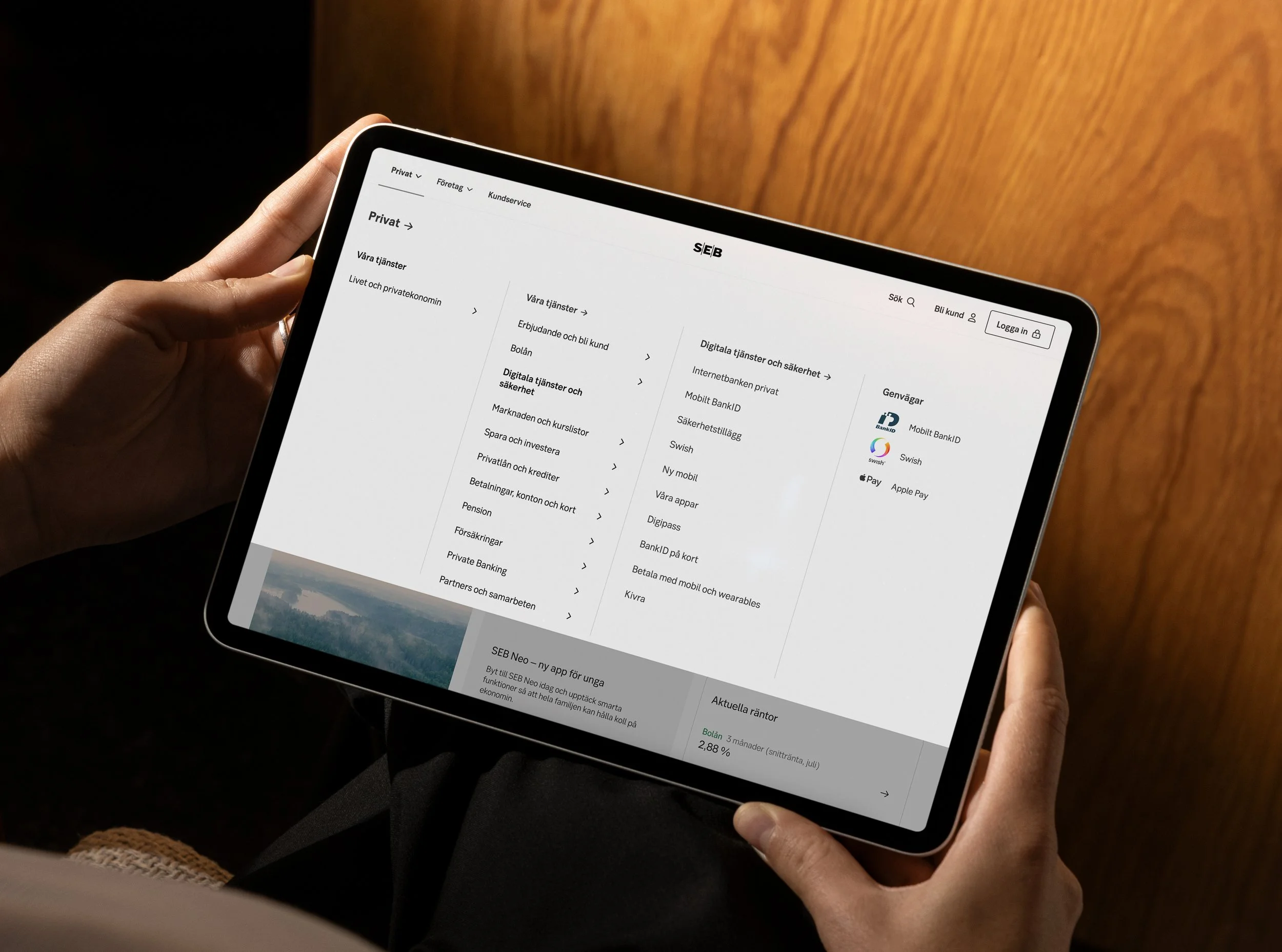
Current solution of mega menu is cluttered and the discoverability is low
How might we. How might we improve the structure of the mega menu to make content more discoverable?
Solution. Instead of presenting all pages at once, the customer has to click through the link structure to find the right one, since we don’t know what the customer is initially interested in.
Mega menu and navigation
Customer-centered and content-driven design that enhances discoverability
New solution

The new navigation structure and menu provide a clean and complete impression, offering visitors an easier way to start or restart customer journeys, regardless of where they are on the website.
“Livet och privatekonomin” is on same hierarchy level as products

All links are clickable and contains landing pages
Visitor navigates themselves through the taxonomy
Shortcuts to the most visited pages and journeys
Fits the new brand guidelines
Landing pages
The landing pages help the customer move forward or discover new content

Under the new SUDA framework, each breadcrumb is clickable and connects to a landing page, helping users either continue their journey or find new relevant content, both within the same taxonomy as well as cross-domain.
Possibility to add cross-site content
All links in breadcrumb has a landing page
Every landing page follows same content template strategy (SUDA)
Possibility to add more information about current offerings
Shortcuts to highly used tools and application flows
Life and personal finances
New section and hierarchy weight for emotional and lifestyle content

Previously, ‘life and personal finance’ was a subcategory alongside all the products. We moved the section up one level so that it now occupies the same space as the products themselves.
Changed naming from ‘Händelser i livet’
Same hierarchy weight as products
Rethinking the emotional content compared to product
Fresh and decluttered landing page leading to sub-pages
Clear cross-domain CTA when a product is proposed